Månadens Post
The Poster of Cuba
Publicerat 2010.08.11
Ulises Morales Lamadrid, Havanna, Cuba
Affischen har en speciell plats inom den kubanska konstvärlden och med sin särpräglade stil och estetik får den ständigt nya beundrare, även utanför landets gränser. I dagens Havanna finner man gott om både nya och gamla filmaffischer till försäljning i turistkvarteren. De politiska affischerna från, framför allt, 1960- och 1970-talen finns återgivna i ett flertal böcker och, i fall av begränsade upplagor och nyproduktioner, betingar de ofta ett högt samlarvärde. Ulises, en kubansk konstnär hemmahörande i Havanna, frågar nedan om det är möjligt att tala om Affischen med tusen ord. Frågan anspelar på vidden av temat. För att förstå vad affischen betyder på Cuba idag måste man gå till dess historia.
Can one speak about the Poster in one thousand words?
Generally, when one speaks about graphic design in Cuba, one tends to minimize the importance of the period before 1959 in Cuban graphics. It becomes reduced to the apparent foreign influence and its sporadic commercial publications. As such, it is not fairly measured as the influential process it actually was. However, despite the manual manufacturing of publications in the beginning, the historiography of Cuban graphic design was connected to the industry and the introduction of advanced technologies. When Colonial Havana took its farewells at the end of the nineteenth century, it left behind a debate between a renewing of press advertisement, painted poster advertisements, typographic posters, the introduction of photogravure and the proclamation of the Republic in 1902.
In the early Republic, the poster began charging its visual metaphors with codes of public message. However, in regard to the communicative metaphor, it did not carry enough authenticity and identity to prevail the breeze of the pictorial dominance. In short, the poster was, according to the prominent art and historiography columnist Fernando G Barrios, “…a mercury in perfect masquerade”. However, in the second and third decade of the twentieth century, a group of visual arts artists (Conrado Massager, Rafael Blanco, Enrique Garcia Cabrera and Jamie Valls) showed a certain air of transgression within other sectors of graphic design such as illustration, humor/comics and the Cuban poster work of that time. In 1925, Jorge Mañach commended Jamie Valls: “In his area, the technique of poster and illustration, Valls has been a real initiator. He gave the first class of the firm line, bright and clean, he gave the class of the movement and the grace of the figures. He taught of the character, the local flavor, of criollismo.”
In the formation process of the specific traits of the Cuban poster, the 1940’s encouraged the breakthrough and the flourishing of the political poster associated with electoral campaigns. The premise of the electoral poster was grounded in formality and, while containing elements of Pop art, its objective was to annunciate a candidate for whom it proposed that one should vote. At the same time, a movie art poster style was developed that promoted movies made in the Meccas of the movie industry (USA, Argentina and Mexico). The growth of this poster style was accentuated until the 1950’s when it was summed up by Eladio Rivadulla who, amongst others, showed an undeniable example of talent with the poster made for the movie Tarzan.
Whether agreeing with it or not, the Cuban Revolution comprised the most significant cultural accomplishment in the western hemisphere during the 1950’s and the poster style grew to be one of the spokesmen of the transformations made in this process. The poster embraced the different spheres in the society. With the changed context, it was necessary to redefine the semantics of the communicational ideoesthetics of the Cuban poster stylistics in order to respond to the new ideology of contemporary Cuba. For these aims they made use of organizational bodies like El Instituto del Arte e Industria Cinematográfico ( ICAI), Casa de las Américas, la Organización de Amistad con los Pueblos de Asia, África y América Latina (OSPAAAL), el Consejo Nacional de Cultura (CNC), Comisión de Orientación Revolucionaria (COR), Departamento de Orientación Revolucionaria (DOR), Ministerio de Obras Públicas (MINOP), Ministerio de la Construcción (MICON). These organizations brought with them an army of visual artists originating in commercial and publishing drawing, graduates of San Alejandro, photographers, some autodidacts and also some deified artists, for example, Antonio Fernández Reboiro, Alfredo González Rostgaard, René Azcuy, Eduardo Muñoz Bachs, Félix Beltran, Antonio Pérez, Ñiko, Raúl Martínez, Humberto Peña, Korda, Rafael Zarza, René Portocarrero, Servando Cabrera Moreno.
In the 1980’s, there was a depression in the poster stylistic, primarily due to bureaucratic obstructs and the difficulty to get hold of movies. Following this period the economic crisis of the 1990’s emerged, which generated the exodus and the stagnation of some of the ambassadors of the poster movement. Only the inexorable Eduardo Muñoz Bachs continued to work until his passing away.
In the present time, the poster is restoring from the setbacks it has suffered. The firm training by professionals of the university of design in Cuba (Instituto Superior de Diseño Industrial, ISDI) combined with economic transformations introduced in the late special period is slowly starting to give fruits. The poster is retrieving, even though it has lost its old power of mass movement communicative ideoesthetic. One probable reason for this is the competition and border crossing offered by the new technologies and multimedia. The space left for the poster is restricted to campaigns promoted by various organizations and institutions, across corporate identities or in expositions in museums and galleries.
José Gómez Frésquet, “Frémez” (1939-2007) was an engraver, a designer, art director of various publications and organizer of several mega expositions. He began designing in 1957 in the Havana filial of the publishing agency Harry W. Gratf. In 2005 he won the Nacional de las Artes Plásticas and the design Eduardo Muñoz Bachs.
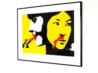
I have heard artists claiming that, for Frémez, it would suffice with just one piece of work to ramify in time, or to catch up with the posterity. That piece would be La modelo y la vietnamita (in eng. The Lipstick) which composes an engraved series (1976-1981). In the symbolic work of anti-imperialist resistance, the artist compares the indifference and the vanity of the model painting her lips with a red lipstick in front of a mirror. This representation of the American society is, in chromatic value, analogous to the blood running from the Vietnamese’s noose, creating proportionality and, at the same time, a contrast between the human tragedy, the destruction and the resistance experienced by the Vietnamese people. They are all made with an admirable power of synthesis: the yellow background (which some interpret as the race of the “vietnamitas”) which, formally, allows to create an atmosphere where that which is said is standing out.
Ulises Morales Lamadrid är konstnär och grafisk designer verksam i Havanna